Mobile SEO for Ecommerce: Why Google Prioritizes Mobile-Friendly Stores
Is your eCommerce store truly mobile-friendly, or are you losing customers without even realizing it? With over 60% of online searches happening on mobile devices, Google now prioritizes mobile-friendly websites in search rankings.
If your store isn’t optimized for mobile, you’re not just missing out on traffic—you’re also losing sales. Google’s mobile-first indexing means that your site’s mobile version determines how well you rank. So, how can you ensure your eCommerce store meets Google’s standards and delivers a seamless shopping experience? Let’s dive into why mobile SEO for e-commerce matters and how you can stay ahead.
The Rise of Mobile Commerce
Mobile Shopping Is Taking Over
Have you ever noticed how often you shop online using your phone? You’re not alone. Mobile commerce (or m-commerce) is growing at an incredible rate, reshaping how businesses sell and how customers shop. By 2025, mobile commerce is expected to make up nearly 44% of total eCommerce sales in the U.S. This means that if your online store isn’t optimized for mobile users, you’re missing out on a massive chunk of potential revenue.
Why Mobile Usage is Driving eCommerce Growth
Today’s shoppers expect speed, convenience, and seamless browsing—right from their smartphones. With faster internet speeds, easy mobile payment options, and social media-driven shopping experiences, more people are choosing to shop on their phones rather than desktops.
Here’s why mobile is dominating eCommerce:
Convenience Wins: Consumers love the ability to shop anytime, anywhere. Whether they’re commuting, waiting in line, or relaxing at home, their phones are always within reach.
One-Click Payments: Digital wallets like Apple Pay, Google Pay, and PayPal make checkout easier, reducing friction and increasing conversion rates.
Social Commerce Boom: Platforms like Instagram, TikTok, and Pinterest now integrate shopping features, turning social browsing into instant buying opportunities.
AI-Powered Personalization: Mobile apps and websites now offer AI-driven recommendations, creating a hyper-personalized shopping experience that keeps users engaged.
How Mobile-First Shopping Is Changing Customer Behavior
Modern consumers, especially Gen Z and Millennials, are digital-first buyers who prioritize convenience, speed, and engagement. They don’t just shop—they explore, compare, and make informed purchasing decisions before checking out.
Shorter Attention Spans, Higher Expectations:
Users expect pages to load within 3 seconds or less. A slow-loading website can push customers away, leading to higher bounce rates and lower sales.
Micro-Moments Drive Purchases:
Ever searched for “best sneakers under $100” on your phone and bought a pair within minutes? That’s a micro-moment—a small, intent-driven action that leads to an immediate decision. Optimizing for mobile means capturing these moments and turning searches into sales.
Mobile-First, Desktop-Second Mindset:
Gen Z consumers rarely switch to a desktop for shopping unless absolutely necessary. If your site isn’t mobile-friendly, they’ll simply move on to a competitor.
What This Means for Your Business
Ignoring mobile optimization is no longer an option—it’s a deal-breaker. Whether you run a fashion brand, a DTC startup, or a subscription-based business, your customers expect a fast, smooth, and mobile-first shopping experience.
Want to stay ahead? Focus on:
Responsive Design – Make sure your site adapts to different screen sizes.
Speed Optimization – Compress images, use lazy loading, and minimize unnecessary scripts.
Seamless Checkout – Reduce form fields and offer digital wallets for quick transactions.
Social & Mobile Marketing – Invest in Instagram, TikTok, and influencer-driven campaigns to attract mobile-first shoppers.
Also read: E-Commerce SEO Checklist – A Practical Step-By-Step Checklist
Google’s Mobile-First Indexing: What It Means for Ecommerce
What is Mobile-First Indexing?
Google’s mobile-first indexing means that Google primarily looks at the mobile version of your website to determine its ranking in search results. If your site isn’t mobile-friendly, your rankings could take a hit, even if your desktop version is well-optimized.
This shift happened because most people now search and shop using their smartphones. Instead of treating mobile as a secondary version of a website, Google now prioritizes it. Simply put, if your mobile site isn’t up to par, your SEO performance—and ultimately, your sales—could suffer.
How Google Ranks Mobile-Friendly Websites Over Desktop-First Sites
When ranking websites, Google considers factors like page speed, user experience, content readability, and mobile usability. A site that loads fast, looks great on small screens, and offers a smooth experience will rank higher than one that’s clunky and slow on mobile.
Here’s what gives mobile-friendly sites an edge:
- Responsive design that adapts seamlessly to different screen sizes
- Fast loading times (ideally under three seconds)
- Easy navigation with tap-friendly buttons and menus
- Readable text without zooming in
- No intrusive pop-ups that disrupt the browsing experience
If your site still follows a desktop-first approach, Google will see it as outdated and rank it lower. That means fewer visitors, less traffic, and lost revenue.
The Impact of Poor Mobile Optimization on Search Rankings
Ignoring mobile optimization can push your store down in search results, making it harder for customers to find you. A slow or unresponsive mobile site leads to higher bounce rates, meaning visitors leave without making a purchase.
If you want to stay visible, competitive, and profitable, mobile SEO isn’t optional—it’s essential.
Why Google Prioritizes Mobile-Friendly Ecommerce Stores
User Experience (UX) Matters
Google’s main goal is to provide users with the best possible search experience. That’s why mobile responsiveness is a key ranking factor. A well-optimized mobile store offers smooth navigation, fast loading times, and an engaging shopping experience. If your site forces users to zoom in, scroll excessively, or struggle with broken layouts, they’ll leave—hurting both your conversions and your SEO rankings.
A mobile-friendly site makes it easier for customers to browse, find products, and complete purchases without frustration. The better the experience, the longer they stay, and the more likely they are to buy.
Faster Loading Speeds and Core Web Vitals
Speed is everything in mobile SEO. Google measures loading times through Core Web Vitals, which focus on three key factors:
- Largest Contentful Paint (LCP): How fast your main content loads
- First Input Delay (FID): How quickly users can interact with your site
- Cumulative Layout Shift (CLS): How stable your page elements are as they load
A slow mobile site frustrates users and increases bounce rates, signaling to Google that your site isn’t providing a good experience. Fast-loading sites, on the other hand, keep users engaged and improve rankings.
Mobile Usability Factors
Google also evaluates how easy your site is to use on mobile devices. Touch-friendly buttons, readable fonts, and properly optimized images all play a role in keeping visitors engaged. If customers struggle to tap buttons or read text, they’re more likely to leave—leading to lost sales and lower rankings.
Google’s Algorithm Updates and Mobile Compatibility
Since Google’s Mobilegeddon update in 2015, mobile-friendliness has been a top priority. Later updates, like the Page Experience Update, reinforced the need for fast, responsive, and user-friendly mobile sites. If your eCommerce store isn’t optimized, it won’t just frustrate users—it will also struggle to rank on Google.
Essential Mobile SEO Strategies for Ecommerce Stores
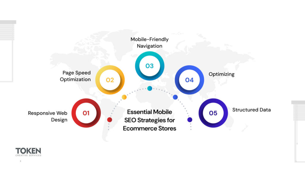
Responsive Web Design for a Seamless Experience
A responsive web design ensures that your online store looks and functions perfectly across all devices, from smartphones to tablets. Instead of creating separate desktop and mobile versions, a responsive design automatically adjusts to different screen sizes. This improves user experience, reduces bounce rates, and helps Google recognize your site as mobile-friendly, boosting your search rankings.
Page Speed Optimization for Faster Performance
Slow-loading pages frustrate users and drive them away. Google’s PageSpeed Insights tool helps identify speed issues and offers actionable suggestions to improve performance. Compressing images, enabling browser caching, and using a content delivery network (CDN) can significantly speed up your site. A fast-loading mobile store keeps users engaged and increases conversion rates.
Mobile-Friendly Navigation for a Better Shopping Experience
A cluttered navigation menu can ruin the mobile shopping experience. Keep menus simple, intuitive, and easy to access. A sticky navigation bar, a collapsible menu, and a prominent search bar can help users find products quickly. The checkout process should also be smooth—one-click checkout options, auto-filled forms, and guest checkout features make a big difference in reducing cart abandonment.
Optimizing for Voice Search
With the rise of digital assistants like Siri and Google Assistant, voice search is becoming an essential part of mobile SEO. Shoppers now use conversational queries like “Where can I buy eco-friendly sneakers near me?” rather than short keywords. Optimizing product descriptions and FAQs with natural, question-based language increases your chances of appearing in voice search results.
Structured Data for Mobile Search Visibility
Adding schema markup helps Google understand your content better and display rich snippets in search results. Product ratings, prices, and availability appear directly in search results, improving visibility and click-through rates. Mobile users are more likely to engage with results that provide detailed, structured information at a glance.
Common Mobile SEO Mistakes to Avoid
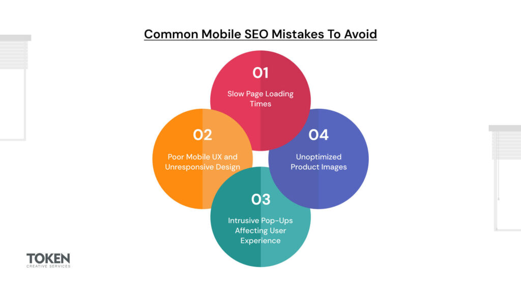
Slow Page Loading Times
Speed is one of the biggest factors in mobile SEO. If your eCommerce site takes more than a few seconds to load, visitors will leave before they even see your products. Google considers page speed as a ranking factor, so a slow site can push your store down in search results. Large image files, excessive JavaScript, and unoptimized code are common culprits. Using tools like Google’s PageSpeed Insights can help identify performance issues and provide solutions like image compression, lazy loading, and browser caching to improve load times.
Poor Mobile UX and Unresponsive Design
A website that isn’t designed for mobile screens creates a frustrating experience for users. If shoppers have to pinch, zoom, or scroll excessively to view your products, they’re more likely to leave. Google prioritizes mobile-friendly designs that adapt to different screen sizes seamlessly. Investing in responsive web design ensures that your site looks and works great on any device, keeping users engaged and improving your rankings.
Intrusive Pop-Ups Affecting User Experience
Pop-ups can be useful for promotions and lead generation, but on mobile, they often do more harm than good. When a pop-up covers most of the screen or is difficult to close, it disrupts the user experience. Google penalizes sites that use intrusive interstitials, which can lead to lower rankings. Instead of full-screen pop-ups, consider exit-intent pop-ups or small banners that don’t interfere with navigation.
Unoptimized Product Images Leading to Slow Loading
High-resolution product images are essential for showcasing your products, but unoptimized images can slow down your site significantly. Large image files increase load times, frustrating mobile users. Compressing images, using WebP format, and enabling lazy loading ensures that images load quickly without sacrificing quality. Faster-loading pages mean happier customers and better SEO rankings.
Related Read: Breaking Down Barriers: How Shopify Democratizes E-Commerce
Measuring Mobile SEO Performance
Optimizing your eCommerce store for mobile is just the first step. To stay ahead, you need to track performance, analyze user behavior, and make continuous improvements. Here’s how you can measure your mobile SEO success.
Use Google Search Console and Mobile-Friendly Test
Google provides free tools to check how well your site performs on mobile. Google Search Console helps you track mobile-specific issues like crawl errors, indexing problems, and mobile usability reports. The Mobile-Friendly Test allows you to analyze individual pages to see if they meet Google’s mobile standards. If there are any issues, Google provides actionable recommendations to fix them.
Analyze Bounce Rates and Mobile Conversions
A high bounce rate (when users leave your site after visiting only one page) often signals poor mobile UX. If visitors aren’t staying long, it could mean your site is slow, hard to navigate, or not engaging enough. Google Analytics helps track how mobile users interact with your store, showing which pages drive conversions and which need improvement. Optimizing checkout flows, product pages, and calls-to-action (CTAs) can reduce bounce rates and increase mobile sales.
Implement A/B Testing for Mobile Optimizations
Not sure if your mobile layout, product pages, or checkout process are working well? A/B testing allows you to compare different versions of your site to see what performs best. You can test button placements, CTA colors, mobile navigation layouts, and even page load speeds to determine what drives the highest engagement and conversions.
Tracking and refining your mobile SEO strategy ensures that your store stays competitive, ranks higher on search engines, and provides the best possible experience for mobile shoppers.
Boost Your Mobile SEO with Token CS
Looking for an all-in-one solution to optimize your eCommerce store for mobile? Token CS provides cutting-edge tools and expert strategies to ensure your site is fast, mobile-friendly, and fully optimized for search engines.
Why Choose Token CS?
- Seamless Mobile Optimization – We enhance your store’s speed, design, and user experience, making sure it meets Google’s mobile-first indexing standards.
- Advanced SEO Tools – Get real-time insights, keyword tracking, and technical SEO improvements to boost your rankings and visibility.
- Lightning-Fast Performance – Our optimization techniques improve page speed, mobile usability, and overall site responsiveness.
- Conversion-Driven Strategies – From A/B testing to structured data implementation, we help maximize mobile conversions and reduce bounce rates.
Stay Ahead in the Mobile-First Era
With Token CS, your eCommerce business is equipped with everything needed to dominate mobile search results and provide an unmatched shopping experience. Ready to future-proof your store? Let’s make mobile SEO work for you!
Conclusion
Mobile SEO is no longer optional—it’s essential for the success of your eCommerce business. With the rise of mobile shopping and Google’s mobile-first indexing, optimizing your store for mobile can directly impact your search rankings and conversion rates. But remember, mobile SEO isn’t a one-and-done task. As Google continuously updates its algorithms, staying ahead requires ongoing adjustments and optimization.
By prioritizing a mobile-first strategy, your business can offer a seamless shopping experience, improve visibility in search results, and increase mobile conversions. It’s time to invest in mobile optimization to ensure your eCommerce store not only survives but thrives in today’s mobile-driven world. Stay proactive, keep testing, and watch your business grow.
Related Articles
Why DIY SEO Fails Most Business Owners (And What to Do Instead)

Freelancer vs. SEO Agency: Who Should You Trust with Your Website?

Let Us help you!
Have a question for our team? Want to learn more about what we offer? Already know what your company needs and just want to have a conversation with us?
Follow us for more helpful content.
Let Us help you!
Have a question for our team? Want to learn more about what we offer? Already know what your company needs and just want to have a conversation with us?